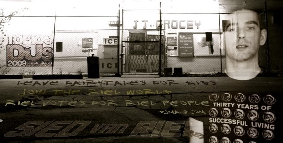
Ah new here first post I thought it best in something I have some knowledge about. I like the piece however I think your typography and effects that were put in the font itself take from the image.
If you found a better way to manipulate the typography to make it more interesting I think it'd make the piece more complete. The transition from the guy to the background also might look better if it was smoother.
I like what you have started here it's nice and easy on the eyes I think with some small tweaks it'd be amazing.